4 Steps to Breaking Down Complicated Content
Our world today is complex, overlapping, and intersectional. While it keeps life interesting, it also makes it difficult to communicate complicated, nuanced messages. If your nonprofit organization is struggling to share your message with your various audiences, you’re not alone. There’s so much to untangle—
Where do you start?
What are your key points?
Are you looking to talk to your existing audience, or expand to new folks?
What actions do you want them to take––and more importantly, are those actions realistic with someone who has recently been introduced to your cause?
It might feel like climbing a very messy, complicated mountain to climb. And it kind of is. But with a little bit of structure and curiosity, it becomes a lot easier to learn and iterate to better connect with your audience.
When faced with communicating a complicated message, we like to approach it with a four-step system:
1. Explain it to a 10-year-old
Every cause has multiple reasons why someone should care, and depending on the size and structure of your organization, some may have more internal weight and priority than others. It’s critical that you align on your simplified messaging from the jump––ideally considering your audiences and their reasons to believe, but also understanding internal politics can sway this step.
Distilling this messaging down to something a ten-year-old can understand will help breadcrumb your messaging in a way that’s quickly consumable by most audiences, regardless of the platform.
Another way to think about it is to make it bumper-sticker-level simple. If why people should care can’t be figured out at a stop light, it’s too complex for a digital audience.
2. Identify your potential vehicles to deliver this message.
Your organization likely has a wide array of options for how to get this message out into the world. Here are some options that come top of mind:
Social Media:
Cons: Generally limited in the amount of content you can fit in a post. Users are usually on their endless scrolling journey, so it can be hard to capture their attention.
Pros: Millions of potential viewers and the opportunity for them to easily share your message. Free, with the ability to only pay what you want for ads (no minimums). Can link to more in-depth content. Trackable.
Email:
Cons: Only lives with your existing audience (unless you purchase a list). Drip campaigns can take some time to feel like they’re working. Can get lost in the mess of an inbox.
Pros: Can tell a more developed story at once. Trackable. Can push to more in-depth content. Can do a drip campaign where you tell a bit of the story at a time.
Website or Dedicated Landing Page:
Cons: It makes for a poor first step in a user journey since unless folks are actively searching for information, they likely won’t stumble across it. If it’s on your proper website, not a dedicated landing page, the bounce rate might increase with other shiny objects on the site.
Pros: Opportunity to create in-depth, compelling stories. Endless ways to communicate through text, graphics, videos, or even web-specific features that surprise and delight the viewer. Can include email capture to continue the conversation.
Paid Advertising:
Cons: Likely a first touchpoint for a lot of your target audience, so messaging needs to be direct and engaging. If it’s paid search, folks will be needing to search for your cause (or relevant keywords) to show up. And for social, you’ll be competing in the endless scroll of posts.
Pros: This is the best way to find new audiences and establish a larger base of support. Plus, with proper research, you can hone in on a message that will resonate based on your targeting parameters. While paid advertising isn’t perfect, it can introduce you to folks who didn’t know they wanted to hear your message, but are so happy they did.
With any of these examples, you’ll always have the opportunities to use text, graphics, and video to convey the story. Lean into the platform’s strengths and standards––such as a lower budget, iPhone recorded video on TikTok is great, but depending on your audience, that level of production might be frowned upon for YouTube or embedded on your website (unless it was really well done – you’ll lose credibility if you’re showing Blair Witch-inspired content in most cases). Instagram is perfect for graphics and video, and Instagram and Facebook can utilize the carousel posts to use graphics to bring a storyboard to life.
3. Construct your ideal user journey
Once you’ve defined your audiences, and have identified where you can find them online, whether through organic or paid social media, your email list or paid list acquisition, etc. you can get started breaking down your story into bite-size, digestible bits.
Your audience can only consume so much information at a time, so organizing your content in such a way that can drop tiny, delicious, memorable breadcrumbs for them is key. A good pattern to establish with this is first, what is the absolute bare minimum they need to know? And second, what do you need them to do about it?
The next time you engage, add a bit more to the story or tell it in a different way, with more details. The more engaging your content, the larger of a request you can make. So if it’s a simple social post, don’t expect someone to immediately call their Senator after one engagement (calling people is terrifying).
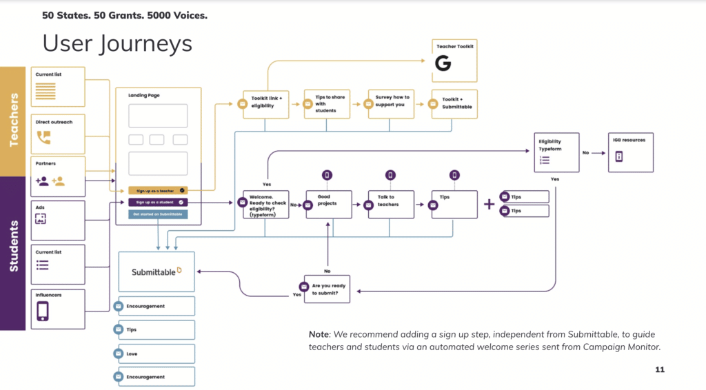
A traditional user journey would be a social post (or multiple posts) that lead to a landing page where they can sign up for emails to stay engaged, maybe donate to your organization, or learn talking points to share with friends or even (gasp) call their reps.

4. Test and track
No matter what your user journey is, make sure you’re checking the analytics of it to see if there’s a huge drop-off in the flow. By tracking your results, you’re able to tweak copy, graphics, videos, calls to action, etc. to optimize results over time to engage with your specific audience.
Some common problems + solutions:
Are social followers clicking to your landing page, but not taking the action you’ve requested there?
First check – make sure your site is mobile-friendly. The majority of social traffic is on mobile, and if your landing page only functions properly for desktop users, that could lead to a huge drop. Next, check how many actions you’re asking for people to take on your landing page. It should be just one. Resist the urge to add more, letting them click away. Are you giving them more supporting information that’s in line with the social posts they saw? If not, ensure alignment across all channels so they don’t feel like it’s a bait-and-switch situation.
Are your emails not getting opened, or the links aren’t being clicked?
Try testing your subject lines and senders––but not all at once. First, try a new sender. You can test between your organization’s name and a person who might have some name recognition with your audience. Next, try a testing strategy with your subject lines to see what kind of messaging hits home. Lastly, ensure your buttons work and the CTAs clearly spell out what they should be clicking.
Testing also includes quality assurance testing before your materials get published––ensure it’s proofread, links work, tracking works, and everything is working on desktop, mobile, and across different browsers.
Example
So you can see how these four steps work in practice, we’ll use a recent award-winning campaign for the Center for American Progress and their Generation Progress campaign as an example. Their challenge was to communicate how the seemingly unrelated issues of that merged the issues of abortion access and student loan forgiveness are actually connected. And not only that, but also get young people to care as an example.
Some background:
Generation Progress is a national advocacy and education organization housed within the Center for American Progress that promotes progressive solutions to the political and social issues that matter to young people.
In late 2020, they were awarded a grant to be used to support a campaign focused on educating young adults about the intersection of abortion access, economic justice, and canceling student loan debt. Their big ask: sign a petition to Congress demanding equal access to abortion.
Abortion access. Economic justice. Student loan debt. Racial justice.
That’s a whole lot to string together.
Here’s how we applied the four steps:
Explain it to a 10-year-old
To break down this extremely complex issue, we realized we needed to focus on the fact that women of color were most impacted by both of these issues. While a 10 year old might not understand all the nuances around racial justice in America (hell, most 40 years olds don’t), they can understand two bad things impact a population, making it exponentially worse for that population (do 10-year-olds know exponents?).
Identify your potential vehicles to deliver this message.
We knew our vehicles would primarily be social media (Instagram) and a landing page to make the one ask very clear and direct.
Construct your ideal user journey
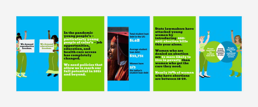
To start with social, shareable graphics were extremely popular at the time. So we created a carousel of images that broke down story slide by slide. Without getting too much in the weeds, we considered what was the absolute bare minimum we needed someone to know to understand the issue. It could be cause and effect––because of X, Y happens. Or the position we’re standing for––demanding reproductive and educational freedom.
Through the carousel, we needed to make the connection that limiting abortion access and high student loans rates both target women of color. We took the approach of showing statistics for each of those issues individually. Women hold ⅔ of the student loan debt in the nation AND women who are denied an abortion are four times more likely to live in poverty. Beyond both of those issues impacting women, we used a classic Venn Diagram of the issue areas, and found women of color live in the overlapping space.

The post copy asked them to click the link to the landing page, which walked them through a more detailed take of the issues and why they mattered.
Test and track
While we were able to put some money behind the posts, at the time Generation Progress had just north of 2,500 followers on Instagram. The carousel posts were viewed 5.6 million times, with over 32,000 people clicking through to learn more. Of those, almost 200 signed the petition.
You can read more about this particular piece of award-winning work here.
While we’re at it, we can add a fifth step. Have patience with yourself and your audience. You live and breathe your cause, so if someone isn’t immediately outraged or calling their reps on an issue, it’s not personal. They still likely care about your cause, but haven’t found their inroad yet to develop a passion for it. They’ll get there. Your work matters. And if you need some help along the way, we’re here. Drop us a line, and we can help you hone your messaging to better connect with your audiences.