Overview
Human-I-T is a nonprofit and social enterprise that fights to end E-waste and shrink the digital divide between communities with and without access to technology by diverting devices from landfills, fully wiping and restoring them, and putting the like-new devices in the hands of communities and individuals who need them most.
Human-I-T first partnered with Media Cause to help with new brand language and an updated logo, resulting in the development of new Brand Guidelines. The next step was designing their website to introduce their refreshed brand to the world and bring even more businesses and organizations into their community-centered mission.
Client

Issue Area
By building a more modern and user-friendly website that appeals to multiple audiences, we were able to help Human-I-T and their mission to divert waste from landfills and ensure tech access for everyone.
After a successful brand redesign, Human-I-T knew the next step was to bring the updated brand guidelines into a new and improved website.
In addition to the branding update, the website also needed significant improvements. As their mission is multifaceted—e-waste removal services and providing low-cost tech—they needed to create a cohesive site that could speak to multiple audiences with equal attention.
Their former site struggled to tell a cohesive story, was difficult for the right audience to find the right information, and hosted pages of extraneous content. They needed a site designed with an audience-first mindset, ensuring visitors could easily find relevant information.

When tackling this project, we had two main goals: one, to better meet each audience’s needs, and two, to visually position Human-I-T as a more current, modern, and reputable organization.
The first step we took was to analyze the audience. Their website serves multiple audiences with extremely different needs. We needed to simplify the existing site and ensure a seamless user journey for potential tech recipients, community organizations, and major corporations that could donate large quantities of technology.
We needed to make a major change to the site map and the general navigation, as the existing one didn’t make sense, and it wasn’t easy for each group to find where they needed to go to get relevant information. There was a lot of excess content and copy on the site that needed to be trimmed down as well.
Once we had our audience segmented and a user journey mapped for each group, we turned to the design. Their existing site was flat and did not reflect the personality of the brand and the empowering work they do. We wanted to design something modern and fresh and create a site that would bring together the human, environmental, and tech aspects of Human-I-T’s mission.
Design + Development
Human-I-T’s existing website was robust and hard to navigate. The ability for users to take meaningful action was buried, and the calls to action didn’t pay off. We knew we needed to simplify the design and make it both engaging and easy to navigate.
We focused on the home page to kickstart the user journey. To ensure all audiences felt represented, we placed the mission statement front and center on the page and included links within the statement for easy navigation.
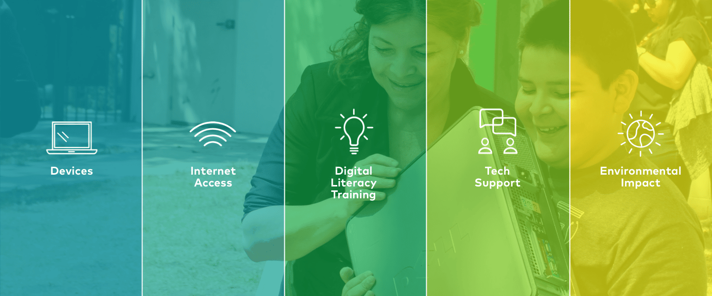
We wanted to include photography of their services and work to show the link between their team and the community, because so much of their brand is about connection. While they had some great existing photos, they all had old branding elements in them (on shirts, in logos, etc.) We tried to crop as many images as possible so that no outdated brand elements were visible. Later, they took the brand guidelines and applied their new branding across touchpoints and were able to provide images of their team and refreshed brand engaging directly with the community.
As we had just completed the brand redesign, much of the site colors and iconography were already built, though we did create a few additional icons and patterns for the site.
We built the design on WordPress and ensured the company was adequately trained and had documentation on how to update the site on their own after the initial launch.
Content Writing
While Human-I-T had a lot of good information on their website, it lacked a cohesive story, and it was hard to understand their mission. A major part of the site redesign was to holistically show who they were as an organization, regardless of specific service vertical.
Given the significant changes to the sitemap and overall architecture, we wrote new copy for all pages—the only exception being the blog. We simplified the messaging, ensuring the next steps or actions were clear regardless of the audience.
The copy needed to convey the story of their programs and circularity while also ensuring that those looking for a new computer didn’t feel they were taking someone else’s trash. They wanted to treat the message with dignity and ensure it was written in a way that was easy for anyone to understand rather than using tech industry jargon.
With the updated design and copy, we developed a new site that reflected the brand style and made it easy for users to navigate.