The Facial Pain Association (FPA) is the largest nonprofit organization that supports individuals of all ages who are impacted by neuropathic facial pain. They are a leader in providing those living with and treating these relatively rare conditions with in-depth information and support.
FPA partnered with Media Cause to modernize their brand and update their website.
Client
Issue Area
Since 1990, FPA has been advocating and offering support for people living from facial pain. And though they continued with that purpose, they have grown and evolved into an organization that is doing more in educating patients, their loved ones, and even medical professionals about neuropathic facial pain. Because of this, they wanted their brand to communicate who they are, who they support, and why their audiences should connect with them.
Additionally, FPA wanted to update the look and feel of their brand to focus on inclusivity—because facial pain wasn’t limited to just one condition. This needed to be reflected in their logo, mission and vision, beliefs, and values.
We concluded that the most direct way of doing this was through their website—redesigning it in conjunction with reimagining their brand to make sure everything was cohesive and communicated a clear message.
We worked with FPA to implement changes that would accomplish this objective and tell their current story both verbally and visually.
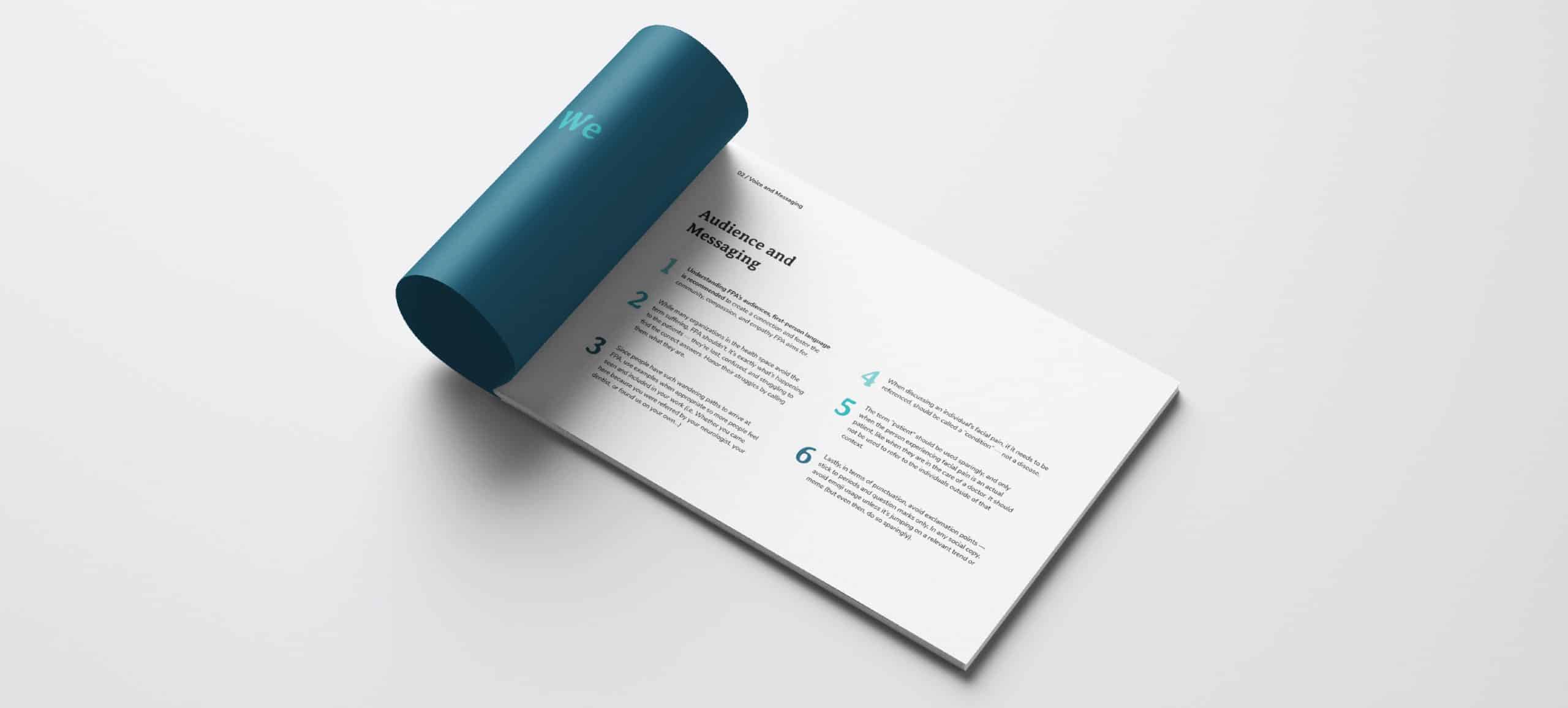
We began their brand revitalization by helping them define who they are—nailing down their mission, vision, beliefs, and values by having them complete a Brand Workbook session. This self-guided brand exploration helped us build their brand foundation of education, advocacy, and resourcefulness and develop a cohesive language with the correct tone and messaging that they can use when communicating with their existing and potential audiences.
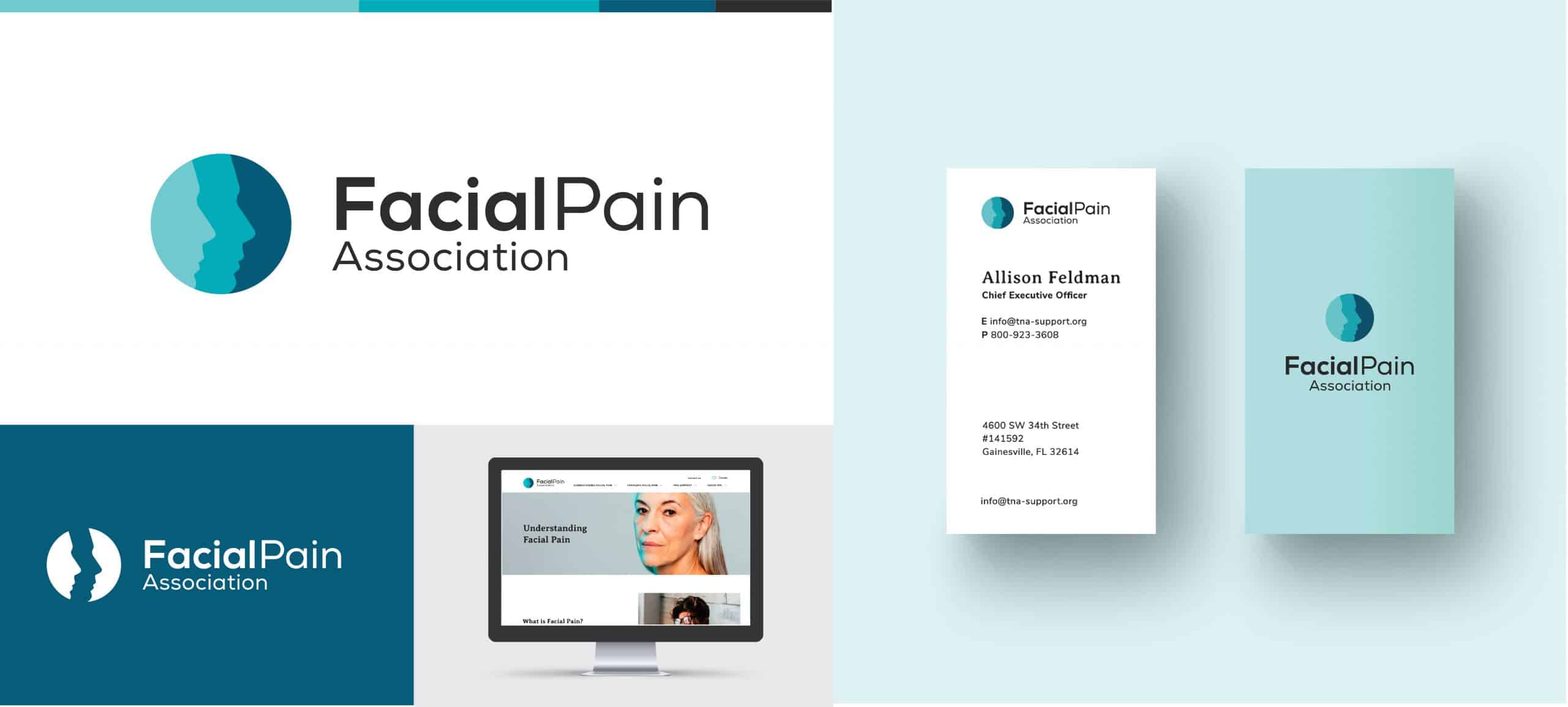
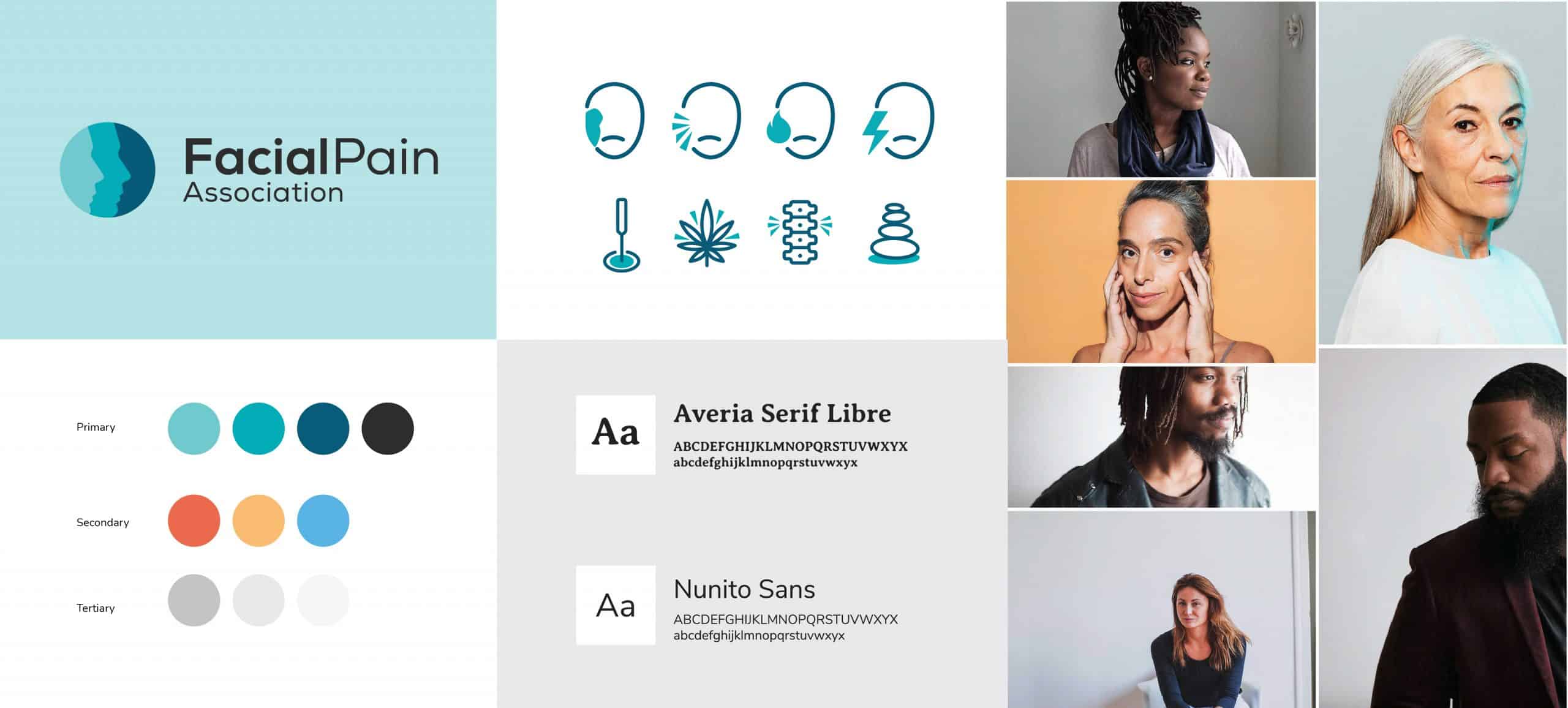
Once the foundational elements were solidified, we moved to updating their visual brand identity. This included a logo refresh, an updated color palette, custom iconography, and a new, and personal approach to imagery. The updated Facial Pain Association logo helped modernize the brand while connecting back to their legacy. Moreover, the new color palette focused on the color teal—the official color for trigeminal neuralgia (TN), which is one of the most common facial pain condition. This approach helped position FPA as a trusted resource in their space. The custom iconography and personal approach to imagery helped bring diversity and inclusion to the forefront—showing that facial pain affects people of all ages, races, and genders.
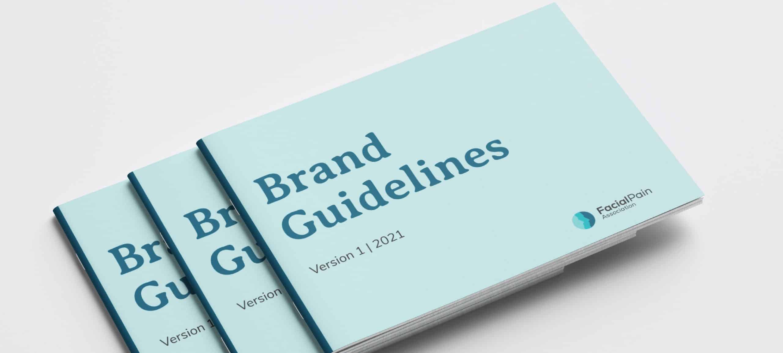
All these brand elements were compiled in a brand guidelines document that now serves as a guide to maintain brand consistency across platforms and collaterals.
Building a Website
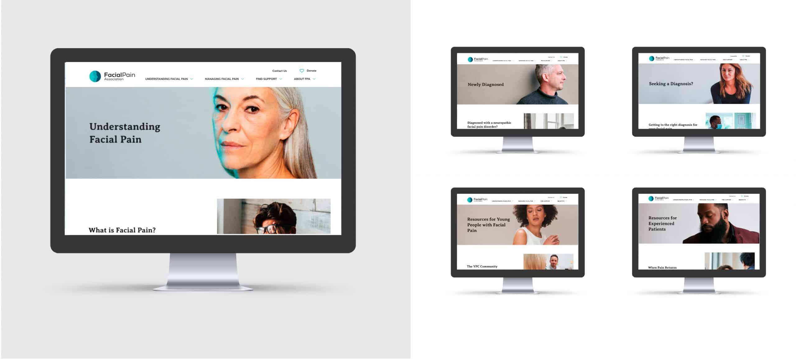
Individuals of all ages can be affected by neuropathic facial pain, but because of the rarity of the disorder, finding information and support is challenging for both people experiencing pain as well as their families and caregivers. Additionally, medical professionals often lack the knowledge to properly diagnose patients—leaving them without proper treatment. Because of these challenges, the FPA’s website needed to become a space where both patients, caregivers, and medical professionals could access information, support, and guidance as they navigate the many facets of facial pain.
With this in mind, our central approach became to design and develop a website that could host a wealth of content, be easy to navigate, and appeal to different demographics and audience segments. Site structure, UX, and information architecture became our first priority, while we worked to synthesize their existing content into different content buckets. SEO was a central focus in developing the overall structure to help the different audiences find the information they need.
After the overall structure and content flow was established, we moved into implementing the established voice and visual brand elements. In close collaboration with the client, we streamlined existing content for the various pages. The visual identity was applied throughout the site with a focus on bringing diversity to the forefront through the use of portrait style imagery showing the many faces of facial pain. The portrait style photography also helped establish a personal connection for patients in different stages of their journey— from newly or undiagnosed to more experienced patients.