Overview
Client

Issue Area
Our challenge? Refresh the website’s look and feel to better convey the vibrancy and momentum of its mission, reorganize the content to tell a more urgent and compelling story, and re-architect the user experience to allow for greater discovery and engagement.
While their organizational focus is on student engagement, school funding, racial equality, and the achievement gap, their website was not successfully communicating their mission to potential donors or supporters, making it challenging for people to understand their goals, and obscuring the successes they’d realized in bringing students together to lead campaigns for social change.

To reach these critical goals, we took three main steps:
1. Research to develop a trusted brand look and feel
2. Designed new brand elements and guidelines
3. Organize and designed new website
We started with a research phase that looked at the education and racial justice space in an effort to determine how to best portray Californians for Justice as a trusted organization. They have a long, established history and we wanted that to come across at first glance.
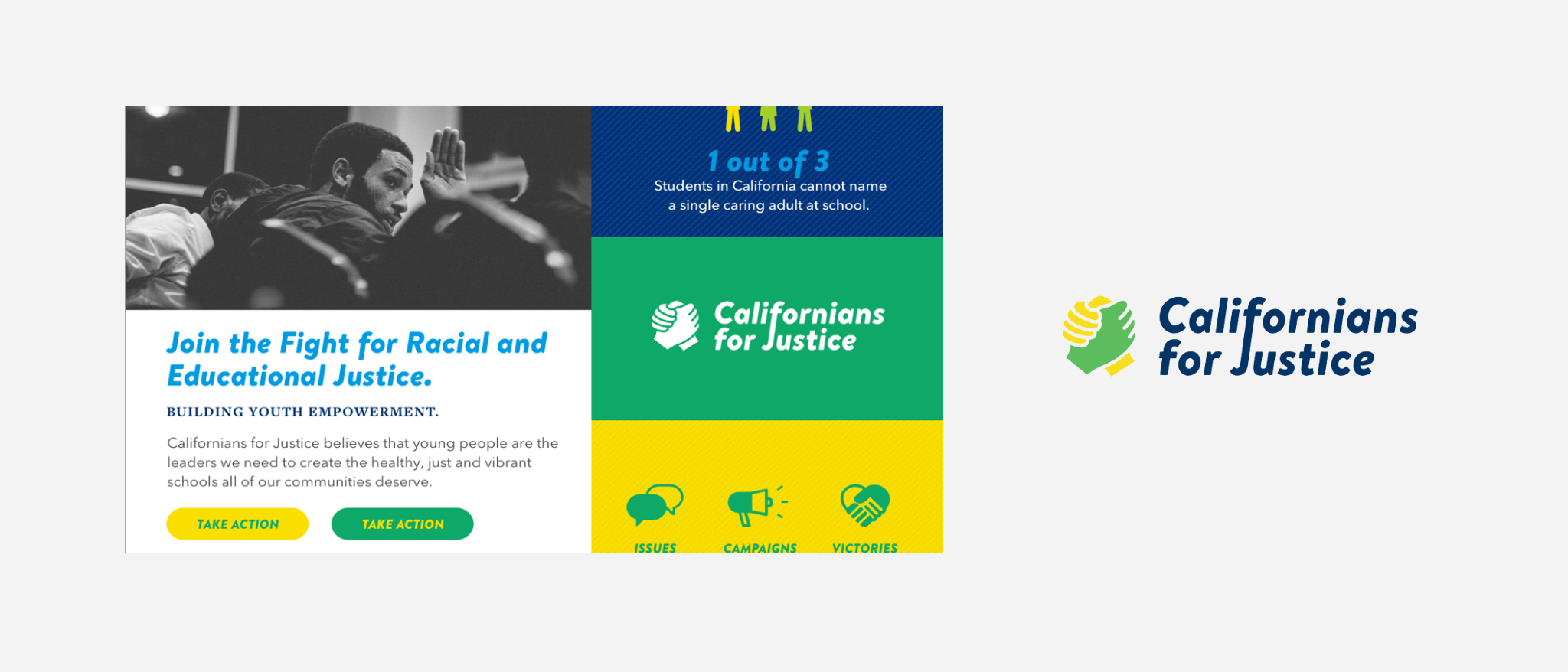
Once the brand research was complete, we dove into create a new logo, color palette, pattern library, typography, iconography and photo style. These elements will be the blueprint for any future projects for the brand.
Next, we took stock of what information they had on their site and what messages they were trying to convey. With a mix of UI, UX and visual design, we laid out the new website, complete with content heirarchy and site map.

To complete the project, our development team created a new WordPress-based website where Californians for Justice could input their content into, and make any timely updates as programs progressed.