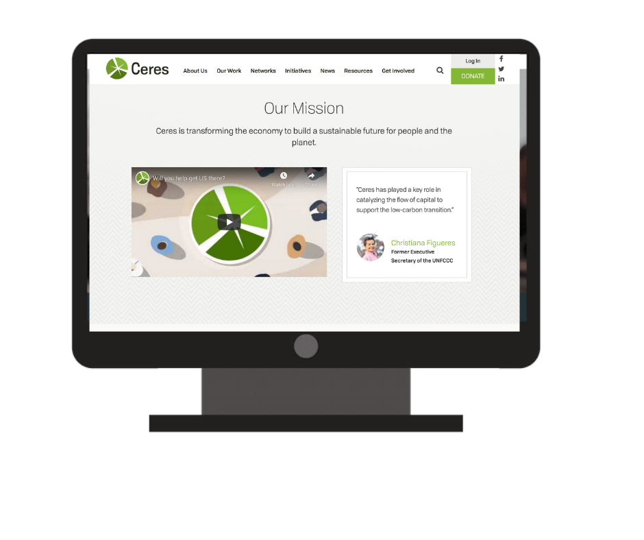
Ceres has a plan to transform the economy to build a sustainable future for people and the planet. In 2019, with the presidential race just beginning to build momentum, and pressure growing on corporations to rethink their environmental practices, they developed a six-year vision for aligning major industries on a path to good—and asked us to turn it into a beautifully designed “Get Us There: The Ceres Strategic Plan.”
The report we helped them organize and design needed to communicate their plan, and the complex concepts within it, to everyone from individual funders to corporate CEOs. To do this, we needed to find a way to ensure the information wouldn’t feel overwhelming or inaccessible. Design would play a major role to support the flow of their story and draw attention to key elements–ultimately, motivating individuals across industries to join Ceres on the path to a more sustainable economy.
As we explored a visual identity for the piece, we wanted to play with the inherent paradoxical beauty of nature: exploring the world around us from both a micro and macro view. We contrasted wide shots of a stunning, forested horizon with textures against a close-up of the veins and fractals in a single leaf. We juxtaposed the vast expanse of wind farms against the detailed plating of a solar panel. Whether it’s up close, or with a bit of distance, our goal was to capture the beauty of nature, and the sustainable manmade elements of nature, that move our world forward. We also took cues from organic shapes and textures to inspire our iconography and graphic elements, such as Ceres’ Theory of Change and their timeline of successes.
