The Design Process Series: Creating a Logo
If you aren’t a designer yourself, the design process can seem like a mystery. But it doesn’t have to be. I think it’s valuable for everyone who works with creative teams to understand the work that leads up to different types of projects. Knowing the full scope of how projects come to life can help make you a better client, teammate, and partner. It can also grow your understanding of design. That’s why I’m sharing my design process with you. This will be the first of a series that dives into common creative marketing projects. Starting off the series is the process of creating a logo.
Special Note: Every designer has their own personal process, which is what makes us all beautifully unique, but most of the steps shared below are common practices.
1. Getting to know the client
The first step is taken together as a team. We get to know the client through a kick-off call. The goal of this is to learn more about the organization from those most closely connected to it. This can reveal some key truths that we wouldn’t be able to find through our own research. Even small anecdotes can lead to big ideas.
It’s also a pivotal time for asking important questions that will shape the rest of the project and get everyone on the same page.
2. Researching the space
Once the project is kicked-off, I get into research mode. I like to conduct my own research on the organization by digging through their current digital presence (if they have one). This allows me to see how they are currently presenting themselves and what might be resonating already.
I also check out the branding of organizations within a similar space. When I do this I’m looking for similarities and differences throughout the industry.
My favorite part of the research phase is looking for inspiration. I like to check out what’s been done in the past. This is not limited to other organizations in the space or even just other nonprofits. Inspiration can come from anywhere.
With these insights, I can start to map out how our clients can be positioned in a unique and authentic way.
3. Asking their audience
An organization’s audience should be at the center of all decisions, especially branding. They are the ones that the logo needs to resonate with. Being able to discuss how the mission of the organization impacts them is key. This helps to form associations between what types of colors, symbols, and typography connect with the audience. Ideally, this is done through 1v1 conversations that include a large and diverse pool of audience members. Putting in the time and effort to do this is the most impactful way to create something that truly embodies an organization.
4. Brainstorming begins
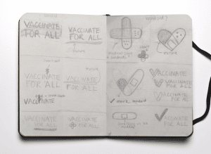
My sketchbook is where my brainstorming happens. I have a pile of sketchbooks filled with the beginnings of all my creative ideas. Creating analog sketches and writing down notes allows me to work out the ideas I have floating around in my head.
Below is a look at sketches that I created when concepting the National Hispanic Medical Association’s new logo for their “Vaccinate For All” campaign. I try not to worry about these being perfect.

5. Giving myself space
“Creativity is not a conveyor belt.” – Amy Small
My “aha moments” typically come to me when I’m not pressuring myself to come up with something. Giving myself the freedom to go for a walk, run, sleep, or daydream helps ideas flow. This is the creative space that is so important for designers to have in order to ruminate on the best solution. Rushing a deadline on any creative project stunts its potential.
6. Choosing colors
Colors are used to represent the values of an organization’s mission. When I pick the color palette of a logo I take into account the color meaning, industry norms, and audience expectations. The insights that I collected from steps 1-3 drive this decision.
Additionally, I keep accessibility top of mind. There are certain color combinations that are indistinguishable to those who are color blind. Being thoughtful about this during the process helps to make sure everyone can connect with the logo.
7. Selecting a typeface
My process for choosing a logo typeface is extremely similar to choosing a color palette. I take into account all the same things that I did in step 6.
Each typeface has a character of its own. For example, some are friendly and fun, while others can be modern and trustworthy. This is something you might not recognize right away, but each does have its own look and feel.
8. Putting it all together
A logo is composed of many important elements that come together to represent an organization, and each needs to be thought through with careful consideration. That’s why it is not until step 8 of my process that I bring everything together.
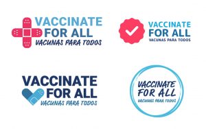
I pick 2-3 of my top sketches and pair them with the colors and typefaces that match the overall feel that I want each option to convey. I typically try to take a few different approaches in order to give the client some variety to choose from. Here’s an example done in partnership with the talented Rob Shaw for the Vaccinate For All campaign:

We provided 4 unique directions that had a different way of conveying the campaign’s mission. Some options leaned into symbols of healthcare, while others focused more on the community aspect of the campaign.
9. Finalizing the logo
As a team, we decide on which logo embodies the spirit of the campaign the most well-roundedly. Once this decision is made I fine-tune the logo by applying feedback and creating black-and-white variations.
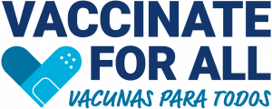
For the Vaccinate For All campaign, we chose the logo below. This direction features an icon composed of a bandaid folded into a heart, which is meant to represent community and healthcare. The shades of blue help to amplify the message that the campaign is trustworthy. The English typeface is strong and bold in order to deliver a clear message, while the Spanish text is a handwritten typeface that adds authenticity.

As you now know, there is a great deal of work that happens behind the scenes when creating a logo. Each of the steps above influences its success. Skipping any steps or rushing through them can be detrimental to the final outcome. This is why it is valuable to understand the space a design needs to think through the best solution. Investing the proper amount of time and resources into a logo is what will most effectively communicate your mission in the long run.
Check out more examples of our brand work here.