Color Theory: Emotion + Bias
Click here to view the presentation and learn more about how color theory informs our creative work at Media Cause.
Media Cause Art Director Rob Shaw and Senior Designer Ansley Luce recently gave an agency-wide (virtual) talk on Color Theory: Emotion + Bias. In it, they talk about the emotional responses to color and how color is used to convey meaning, but also how color can be deceiving and foster a culturally conditioned subconscious bias. We’ve provided a summary, as well as the whole recording of the presentation here because of its timeliness and timelessness.
Part 1: The cross-cultural meanings of specific colors and culturally-specific associations
Color is an important form of communication among communities, but is not always perceived in the same way everywhere in the world. Here are some examples of the way that colors are understood across cultures:
Red represents passion and energy but also danger and violence. In Asia, red is the color of good luck. In Western politics it is associated with conservatism.
Yellow represents warmth, happiness and optimism. In Eastern cultures, yellow represents courage but in the West it used to represent cowardice.
Blue is the most popular color in business, representing trust, strength and honesty. In Western culture, blue is masculine. In politics it represents liberalism.
Green communicates peace, growth and health. Green means “go”. In Western culture, green is considered lucky. In Eastern culture green conveys fertility and regeneration.
Orange communicates confidence and spontaneity. In Eastern culture orange represents creativity. In the US and Canada, orange is associated with Halloween.
Purple carries the connotation of creativity and imagination. In Western culture, purple signifies wealth and luxury. In the LGBTQ community, purple signifies gender fluidity.
Pink has feminine connotations and communicates romance. In Western history, pink has Christian connotations. Nowadays, pink is associated with Valentine’s Day.
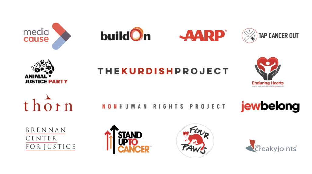
Part 2: How organizations use color in their brands to quickly convey specific values about their mission
Many nonprofits in the animal rights space use red to communicate urgency and visual the harm being done to animals.

Very few nonprofits use yellow, but the ones who do are primarily in the education space. This makes sense because of the happiness and warmth that yellow provides, which is something we want to feel when associating with schools our children may go to.
Interestingly enough, the majority of nonprofits — regardless of their impact areas — use blue as their primary brand color. This confirms earlier statements about blue being the most popular color in business and the fact that it conveys trustworthiness and dependability.
Another popular color with nonprofits is green. As you’d suspect, most of these organizations are in the environmental space.
Many organizations using orange have varied impact areas but use the color to energize or mobilize their audience.
Some nonprofits using purple are in the education space and many organizations using pink are involved in women’s health.
Whether orgs choose color in order to blend in to the field or stand apart from it, it’s important to use color that reinforces one’s mission.
Part 3: How colors work in the brain to create relationships — for better or worse 
Josef Albers said, “Color is the most relative medium in art.” We may understand a color as it relates to others within our culture, but our eyes can play tricks on us. There are some fascinating optical illusions that Albers created that help illustrate this, a few of which I include in the presentation. Color can play with our eyes and our minds, and can create boundaries and shapes that don’t really exist.
We can’t talk about color without talking about race.
The history of how the color came to define humans is, of course, one of white man’s colonization. It began with slave owners wanting to differentiate themselves from their slaves. In the 1700s, Swedish naturalist Carl Linnaeus went so far as to publish a classification of humans that separated people into different races. For centuries upon centuries, color has been used to oppress certain groups of people and maintain a white supremacist agenda. Think about your own subconscious biases about white vs. black. What have you been taught to relate to each of those colors? White is often related to purity, cleanliness, even godliness. And black? The threat that comes with darkness, bile, and dirtiness. Throughout the world, light skin is overwhelmingly favored over darker skin. Of course, that has contributed to much violence here in America.
Though like we’ve discovered, color is relative, and can be perceived in so many different ways, we’ve used it to create boundaries and prejudice that have shaped our world. And, as marketers, it’s kind of our fault.
Marketers have both capitalized on the color bias and perpetuated it by continually presenting white as pure and clean, or even… sexy? And black or brown as dirty or less beautiful and powerful. Brands might not get away with things like this as easily anymore, but they still pop up every once in a while.
There are some things we can do to try to fight this color bias. First, acknowledge that it’s there – consider taking this test called the Implicit Association test to learn your subconscious bias towards race. Then, take steps to counteract the stereotypes, such as using diversity in your imagery, and avoiding cliche stereotypes (white=good, black=bad).
Though we use it to communicate, color can also be divisive. When it comes to race, remember that color can create illusions! We must all work to dismantle this way of using color to divide humans and keep learning about how things came to be this way.
Check out examples of our design work here and contact us for help bringing your nonprofit’s mission to life through design.
Looking for more design tips? Check out our free resource, Designing for Good.