Overview
Serving Cleveland’s vulnerable families for nearly two decades, Passages’ services empower families to improve their lives and successfully achieve family resiliency and financial independence—helping parents break cycles of generational poverty, early parenting, and incarceration for themselves and their children.
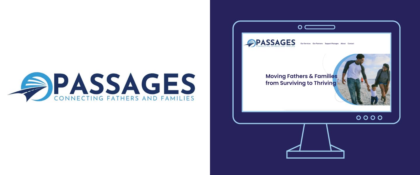
We partnered with Passages on a website redesign to create a more functional site with easy navigation and improved accessibility.
Client
Issue Area
We designed a completely new website for Passages with improved functionality and accessibility, making it easy for both clients and supporters to find the necessary information to support Passages and their work to foster and empower thriving and resilient families through fatherhood enrichment and other support services.
Passages was not seeing the results they wanted from their ad campaigns, much of which was due to the functionality of their website. The site user experience needed serious improvement—it was hard to find information, accessibility was lacking, and it was not optimized for search and conversion tracking. They needed a completely new website to improve the user experience and help drive new traffic.
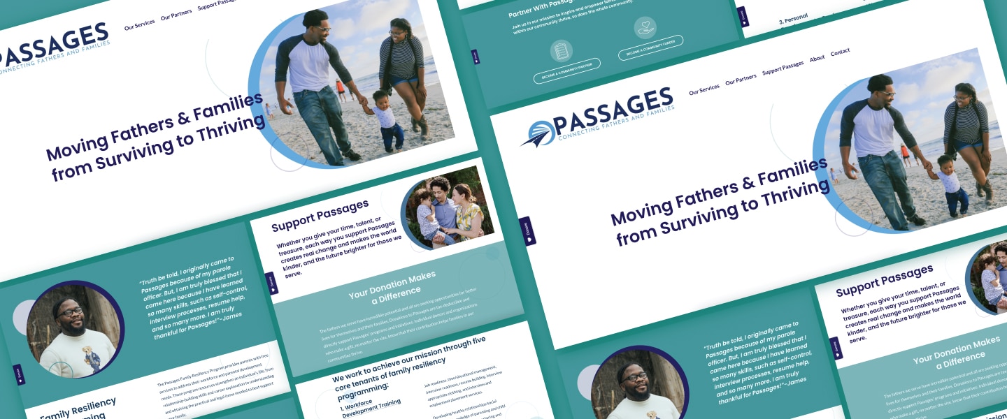
We knew the website needed a complete overhaul, but we also wanted to create something that would be easy for Passages to use after we performed the initial implementation. We worked alongside the Passages team to develop a new look and feel for the site and built it on a no-code platform, Squarespace.
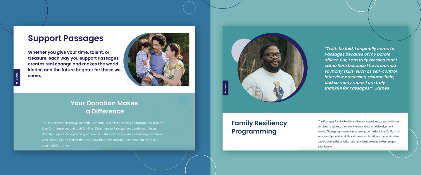
Passages wanted the new site to be warm and engaging, with a spotlight on their clients. It needed to be visually appealing and also easy to read and navigate.
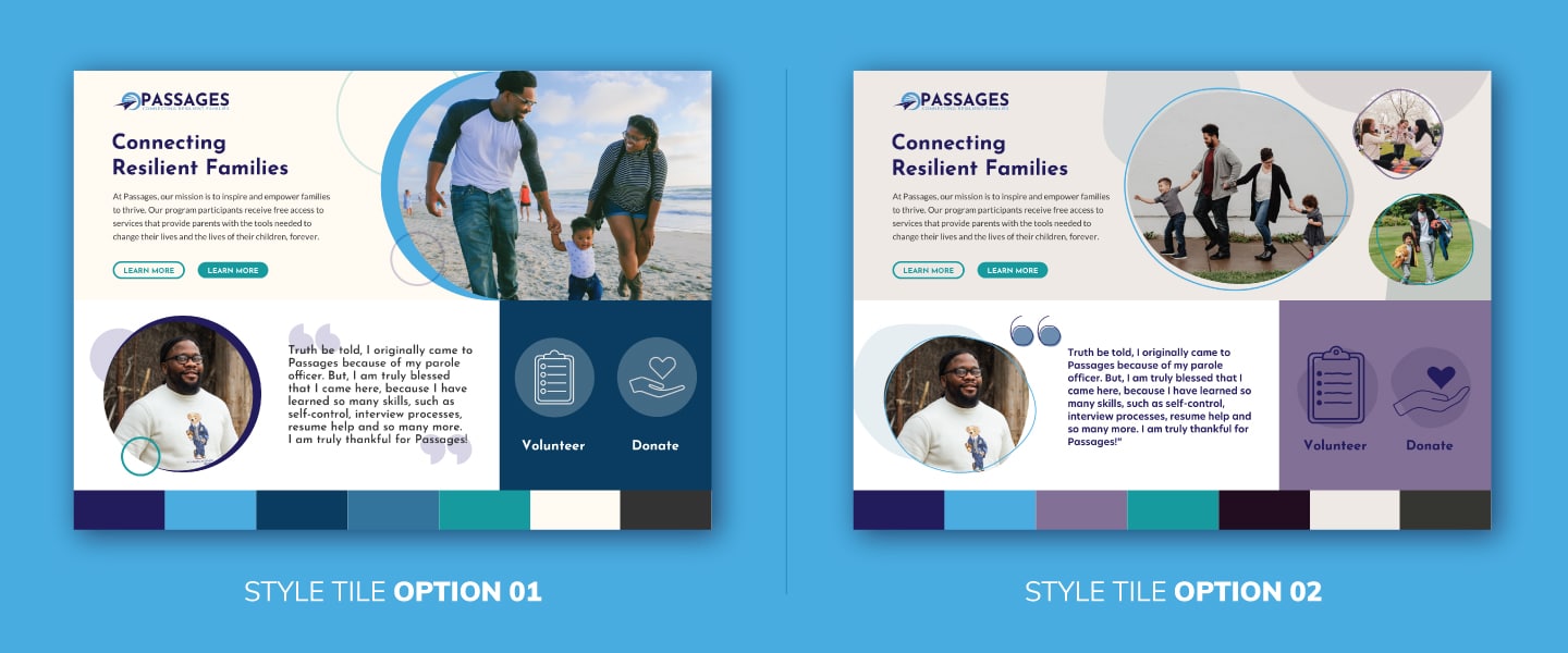
To begin, we presented a few mood board options for the site design. Once the mood was selected, we started to develop pages, checking in with Passages throughout the process to ensure the design matched their vision. As they had a few services that were not yet on the site, we made sure to incorporate them by building new pages for the site.
Once the final design was approved, we brought their existing copy and content over and launched the site. We used testimonials alongside powerful imagery of their programs to tell a compelling visual story.
Our last step was to ensure that Passages was set up for success—giving them documentation and the tools to easily navigate the site’s back end on their own after implementation.
Creative + Design
The creative and design process began by creating style tiles to give a taste of what the website could look like in terms of colors, type, and iconography. Passages wanted the site to feel warm, engaging, and inviting, which we conveyed through the colors and the addition of testimonials to highlight the stories of program participants.
We used their recommended brand font for the headlines and found a new body copy font that would pair well and make everything easier to read. We took their current branding into account but pushed it further with custom graphic headers, frames, and patterns. We used cool tones in the color palette, pulled from the creative assets, paired with a light beige to add warmth.
The result is a warm and inviting site that is user-friendly and easy to read, with clean and clear designs and messaging.
MarTech Support
Squarespace is built for easy use, and our tech team set up the platform for Passages and facilitated the launch. They also included platform integrations, such as an SEO optimization plugin, which helps improve the site for search and, in turn, should help draw in more visitors. When one integration did not function correctly, the tech team was able to troubleshoot and find an alternative—and free—plugin to solve the issue.
We were also able to integrate their existing donation platform and contact forms into the new site.
Website Accessibility
We wanted to improve and optimize the overall site experience. We streamlined the functionality and added more to the service pages for an improved user journey, making it easier to find program info.
Accessibility was a major factor we thought about during the design process. The old website was hard to read, and we knew this was one of the most significant changes we needed to make. When building the site, we followed the Web Content Accessibility Guideline to ensure all pages were accessible.