Slingshot Memphis is an independent assessor that helps make other nonprofits more efficient in their operations in terms of ending poverty in their local community. The organization partnered with Media Cause to assist them with their internal and external communications, as well as an overall nonprofit brand redesign.
Client

Issue Area
Our brand now reflects what we do and who we are! From the words to the narratives to the visuals we use, they all work together to convey a consistent message and achieve the same goals. Media Cause led us to a place where we're finally empowered to communicate our work in a way that can't be misunderstood and excites others to participate in our movement.

Jared Barnett,
CEO, Slingshot Memphis
Slingshot knew they wanted to revamp their brand but weren’t sure how. The organization had evolved significantly over the last 5 years and needed a way to communicate where they are now.
Slingshot knew their brand was a bit confusing, including how they fit into the poverty-fighting ecosystem. In order to address Slingshot’s brand, we really needed to understand where gaps and misconceptions existed. They wanted to develop a brand that was simplified, consistent and built connections.
During the beginning stages of our discovery, we quickly realized that changing their tone and visual expression as well as their confusing brand lexicon would be challenging. By getting these elements together, they’d be able to get their message across inside but outside of the company as well—putting them in the position to attract more investors and clients.

As Slingshot approached it’s five-year anniversary, they realized that they had evolved over the years, their offerings diversified, their reach broadened, and their impact increased. However, the brand messaging has remained mostly the same, not truly reflecting the personality of the team, or the work that Slingshot does.
Together, Media Cause and Slingshot Memphis set out on a journey to change that—to translate the vitally important work that Slingshot does into cohesive, compelling messages that appeal to each key audience group and galvanize support.
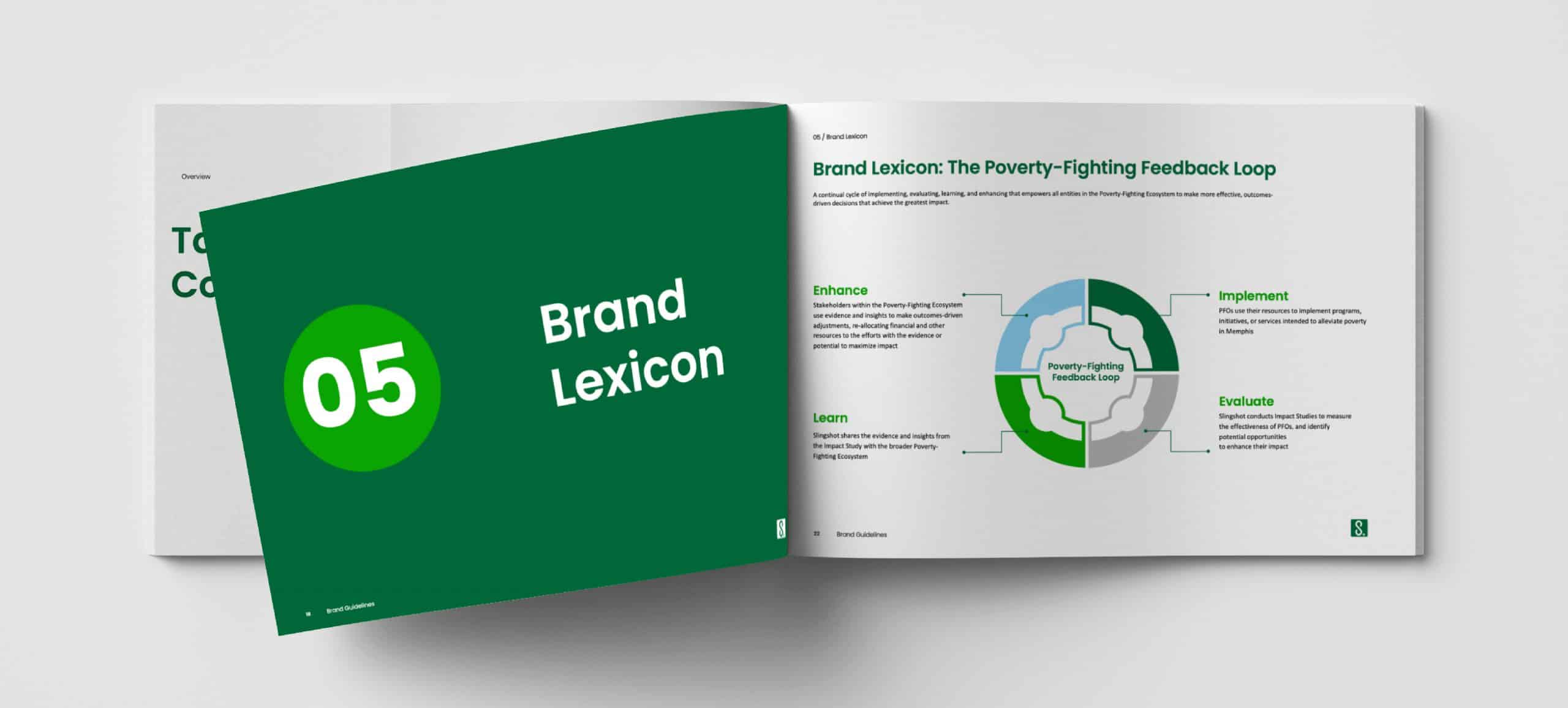
We started by revamping their positioning, which included redefining their mission, vision, values, and beliefs. However, during this process, we found that the words and definitions that they used to describe what they do and the services they offered were inconsistent. This led to the first implementation—recreating their brand lexicon. We wanted Slingshot’s teams to be on the same page when talking about the company and discussing topics that were specific to their brand. This way they had a common language to use when describing the organization.
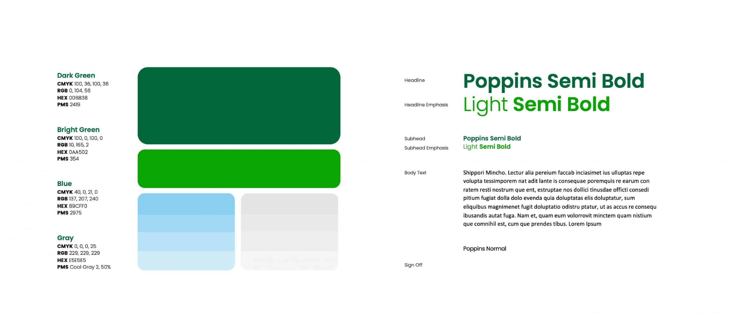
Our team then went back to redefining their positioning and messaging. Once this was solidified, we worked on their visual brand identity. We evaluated the visual brand by redesigning Slingshot’s logo to make it more representative of the company. The previous logo and color scheme needed updating to fit how they currently present themselves. We changed their overall color scheme—implementing similar shades including blues, greens, and teals.
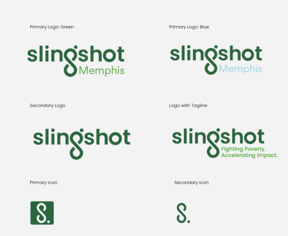
And to give their logo meaning, we made the “G” in Slingshot an infinity loop to represent the feedback loop of their program and the core part of their process—impact + measurement equals the continuation of their work. The dot at the top right of the “G” is meant to show upward motion. It is a slingshot bouncing off the “G.”
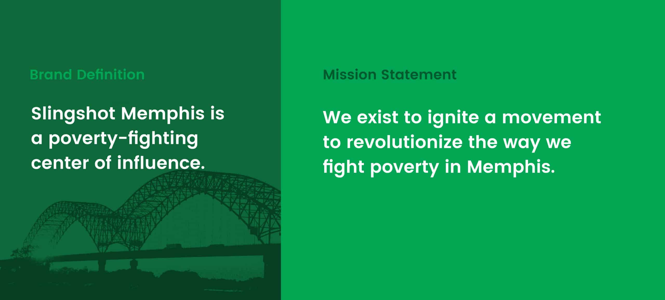


Slingshot’s overall brand is now more unique and easily distinguishable from other similar organizations. With their newly developed brand, they can better communicate what they do, allowing them to better acquire new donors and investors. Next step, Media Cause will help update and redesign their website to match their new branding and messaging.
