Schaffer&Combs is a nonprofit consultancy that helps purpose-driven companies and nonprofits accelerate their positive social and environmental impact.
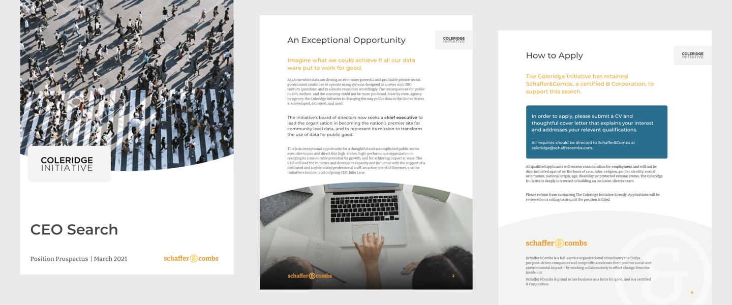
They first approached Media Cause to help separate and rebrand two separate units of their business: executive search and strategic/operational consulting. However, through our research and discovery, we uncovered that their main differentiator was actually the holistic intersection and integration of those services, rather than their distinction. With this insight, we collaborated with the Schaffer&Combs team to restructure and reposition their business as a full-service model, create a unified brand language and new visual identity, and clearly communicate their mission through a complete website redesign, including UX and content strategy, writing, design, and development.
Client

Issue Area
Through our work with S&C, we empowered them to more comprehensively address the complex and often overlapping needs of their clients, encouraging them to see their paths to greater social and environmental impact as integrated, long-term pursuits rather than short term, one-off tasks. This full-service repositioning, along with their new, more approachable visual identity and website, will allow S&C to fulfill their mission, and those of their clients, for years to come.
Everyone we’ve worked with is a consummate professional, experts at what they do, personable, efficient, kind; and the process has been so smooth and productive. All of us are immensely impressed.
Arthur Combs, PHD,,
Managing Partner
Schaffer&Combs’ business model had long been split between two segments: talent search, and organizational strategy. S&C’s leaders found it difficult to bridge the two service categories when pitching potential new clients, and were considering breaking the segments apart into separate business units. This is what ultimately sparked them to engage with Media Cause—to help with dividing and redefining their brand, and presenting it clearly on a new website.
However, during the initial discovery phase, while speaking with stakeholders across various parts of the company, we consistently heard that they believed S&C was most effective at creating impact for their clients when they were able to approach their process holistically, rather than in silos. This insight prompted a shift in the challenge we were aiming to address: rather than breaking S&C into two units, how could we fundamentally better integrate them into one overarching mission—and at the same time, provide more clarity around their individual services so that they could be more readily understood, and valued, by their audiences?
With this new challenge defined, we reviewed Schaffer&Combs existing communications to get a better understanding of how they were currently positioning themselves, and their services, and identify opportunities for strengthening, evolving, or entirely rewriting the narrative. We also reviewed feedback from former and current clients to gauge their understanding of the full breadth of services that S&C offered. What we uncovered was not uncommon for many social impact organizations and companies: incredible capabilities and intent, but inconsistent expression and communication.
Our first step in creating a more unified brand was developing their high level positioning elements. We crafted a singular mission that would reflect their new holistic approach, and more clearly explain what they do, why they do it, who they do it for, and what they hope to help their clients accomplish. We also refreshed their values, beliefs, and personality to more accurately represent the company’s ethos, and ensure that everyone in the organization is aligned on the same north star.
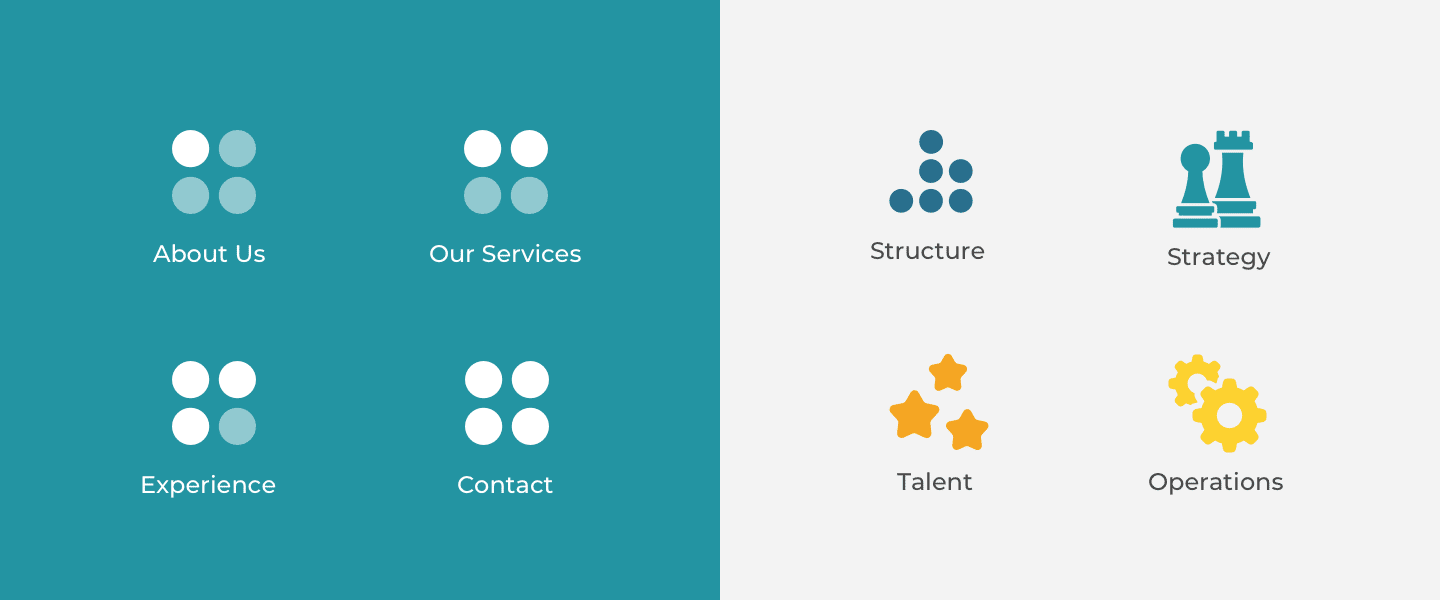
With the highest level of the brand language in place, we turned toward the more granular, and began reorganizing the structure of their individual service offerings into four high level areas that are both complementary, and additive, to each other. We renamed these services to be more clear and consistent, and extended this reorganization into a site map that would be used later to guide their new website design.
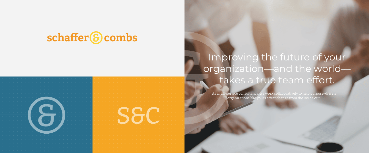
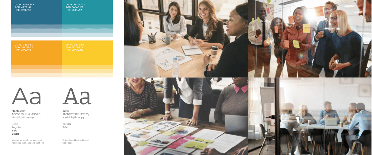
To complete the rebrand, we turned our attention toward re-imagining Schaffer&Combs’ visual identity. We wanted to develop a logo, and a system, that represented both the rigor of the organization’s work, while also communicating the incredibly welcoming, down-to-earth nature of the people behind it. Our redesigned logo emphasized the ampersand as a main design element to bridge those two sides and communicate connection— between the founders, between the company and its clients, between the services they offer, and between their mission and the world. The font is a clean, modern slab serif that also brings two divergent facets together: classic and contemporary. And the bright color palette, which is a purposeful departure from the consultancy category’s dominant blues and greys, brings a sense of friendliness, confidence, and energy to the brand.
Once the brand work was complete, we brought all of these written and visual elements together into a complete Brand Guidelines book, which all members of S&C now have access to in order to make sure their language, visuals, and overall positioning is consistent—and engaging—across all communications channels.