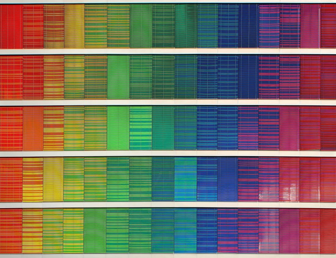
Making the Web Accessible: Color Choices
In honor of GAAD, we’ll be diving into accessibility across digital marketing starting with website accessibility.
Most of the time when I reveal to someone that I am partially color blind, it’s met with surprise. I’ve worked for over 15 years in marketing as a project manager. Often I lead creative projects for website design for nonprofits, and in those projects, the color of something matters quite a bit!
Color blindness and design
For me it’s a subtle issue with greens and reds — deuteranopia is the medical term for it. I can most easily explain it like this: if you show me a bold ketchup red, and a strong Kermit green, I can tell you what colors those are, no problem. If they are slightly darker or lighter shades of red or green though, or if it’s in lower lighting, I struggle hard to tell them apart. They’re “too close” in color for me, and I can’t distinguish between them.
In the marketing world, the challenges are usually most pronounced for me with things like color-coded spreadsheets, charts, or graphs using vague pastel shades. The vague shades are usually indistinguishable to me. Depending on the chart or graph you show me, I may or may not know what it’s trying to communicate. And if I need to understand it I will probably speak up and ask if the colors can be changed to something easier for me to distinguish (bold colors that contrast against each other well). I didn’t always speak up about things like this. I imagine some people don’t speak up at all, perhaps out of fear of perceptions among others they work with.
There are many kinds of color blindness that affect people. For some, it involves blues and yellows, for others, it’s all color. Because of the pervasiveness of color blindness, and to help those who live with it get through their day-to-day tasks with fewer issues, consider creating high-contrast visuals and presentations that don’t heavily require color recognition to convey the information.
Color blindness and the web
Color considerations go beyond presentations in the marketing world. As we try to reach new audiences and engage with our audiences online, designing websites to be accessibility friendly to color blindness needs to be thought through with the same planning and care that we put into navigation and site structure.
Paying attention to contrast ratios is one of the easiest ways we can adapt our websites to be more accessible for color-blind people. For example, if I visit a site that has a combination of pink-colored text sitting on top of a background that is either busy or “too close” in color like a pale green or yellow, it gets a lot harder to read. Paying close attention to the amount of contrast present between the text color and the background is one of the most important things to consider first.
Tools for Design
One great way to help check for this is using the Lighthouse tools built into the Chrome web browser, which can run an accessibility scan on any website and report back instantly how it scores in a variety of metrics including contrast.
By using tools like this, we can identify what needs to change, and a web designer can then make adjustments to fonts, backgrounds, or image selections to improve a contrast score. You can also help quickly remedy broader website accessibility issues using tools that render changes on demand across your site according to a user’s personal needs. One such example tool for this is Accessibe. Their tool provides options on the fly to adjust practically any website to be compliant with common accessibility standards such as WCAG 2.1 and ADA.
It’s important to design with accessibility in mind at the outset of a project.
- Make sure proper alt text is in place for images for those who need to use screen readers.
- Use careful font selections, and consider the contrast when using images as background elements to ensure high contrast.
- Try to avoid areas where colors need to be distinguishable to the user in order for them to comprehend information or progress through a user flow, and look for alternate approaches such as utilizing clearly distinguishable iconography when it makes sense.
Above all, it’s important to keep in mind that accessibility in web design is best when planned ahead, but can be remedied in meaningful ways at any stage in a website’s lifecycle.
Remember that accessibility means accommodating all disabilities, not just ones that are readily apparent. Over 13% of the U.S. population has a visual impairment. Using proper colors, H1/H2 tagging for screen readers, and providing alt text on all images and graphics go a long way in making your site one that everyone can use.
To read part two of this series on accessible design, click here.
Let us know how we can help you transform your website into one that can truly be a place for all of your organization’s audiences to utilize with ease. Download our free guide for more design tips.