The Most Effective Way To Refresh Your Visual Identity
What is the most impactful way to refresh your organization’s identity? Updating your brand’s visual guidelines.
You probably thought the answer would be redesigning your logo, but, below, our design expert will explain why revamping your visual guidelines is the better solution for this. You can have a beautifully designed logo, but the truth is that your audience cares more about the other visual ways you present yourself.
What Are Visual Guidelines?
Visual guidelines are a reference tool that define the building blocks of your overall brand creative and provide guidance on how they can be used to create powerful connections with your audience. The building blocks typically include color, typography, imagery, and graphic elements. The combination of these work together to form a look and feel that communicates who you are and what you stand for to your audiences.
Building Block 1: Color
The use of color is a powerful tool for connecting with your target audience because there are feelings and associations that people attach to specific colors. This makes refreshing your color palette an effective way of repositioning your brand’s aesthetic.
As you refresh your brand’s color palette, keep the values and tone of your new identity top of mind. You’ll want to choose colors that work together to evoke the emotions that you want your brand to be associated with.
How your audience reacts to your color palette might depend on their eyesight, mood, or where they are from. This resource goes into further detail about how to understand the perceptions of color based on your audience.
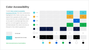
Most importantly, successful brands don’t exclude members of their audience. Make sure your color palette is accessible to all. We recommend using the color contrast tool from Coolors to check which color combinations within your palette are accessible. See this put into practice for Allied Community Resources’ visual guidelines:

Building Block 2: Typography
The typography you define for your brand also reinforces your identity. It may seem subtle, but the design of characters in a typeface, or the particular style of lettering, leaves a lasting impression on your audience.
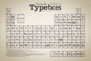
Over the years, typefaces have taken on specific purposes and feelings based on their classifications. They are generally classified based on appearance into one of the following groups: serifs, sans-serifs, scripts, decorative, and monospaced styles. There are nuances to these classifications that are nicely summarized in this resource and in the periodic table below.
When deciding on brand typefaces, start by choosing an option that reflects the brand’s new personality the best. This will typically be used for headlines and print projects. Then, find an accent typeface that is complementary to the main choice. There are several ways to find successful pairings. One of our go-to resources for this is Typewolf.
Once you select your brand typefaces, you’ll want to get more specific by defining the font. Typically the term “font” and “typeface” are used interchangeably, but a font is actually a more precise way to describe a typeface. A font includes the size and weight of your text. In your visual guidelines, you’ll want to define what fonts should be used for different cases, like headlines, subheaders, and paragraph text. This will help with brand consistency, which is a pivotal part of rolling out your new identity.

Building Block 3: Imagery
Imagery is another important way brands can refresh their visual identity. Sourcing and creating imagery should be intentional, relevant, and unique to your brand.
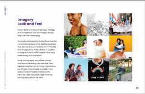
Since a picture is worth a thousand words, you want to make sure it is saying the right thing. This is why it is crucial to define the types of imagery your refreshed identity uses. To do this, think of characteristics that support your mission, empower your community, provide context, and set a new tone. As an example, It Gets Better does an excellent job of establishing imagery guidelines that are authentic to their brand:

Building Block 4: Graphic Elements
Creating graphic elements for your brand is a great way to add more visual interest to your identity and stand out in your space. Graphic elements can come in many forms, including gradients, shapes, iconography, illustrations, patterns, textures, and anything else you can dream up.
To decide which kind of graphic elements you should incorporate into your identity, think about the characteristics of your brand that need more support. Maybe you want to further showcase the connectivity of your brand through lines or add dimension to your brand through textures. Graphic elements can solve many of your design problems and your brand can make use of multiple types.
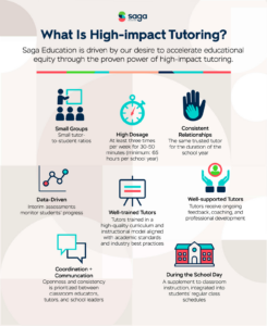
For example, Saga Education uses graphic elements for different purposes. They have geometric shaped patterns that reflect the interconnected nature of their programs. These patterns are used as decorative elements to subconsciously drive home the point of interconnectivity in their imagery. They also use iconography and infographics to better explain their messages, like breaking down what High-impact Tutoring means.


Bringing It All Together
As you now know—your visual identity is more than a logo. It’s the unique combination of colors, typography, imagery, and graphic elements that you choose to communicate who you are, making updating your visual guidelines the most impactful way to refresh your identity.
Visual guidelines should be the starting point for any design needs for your organization. Everyone at your organization should have a copy to ensure they are clear on what your visual building blocks are, as well as why and how to use them.
Whether you need an expert eye to help you define your nonprofit’s visual guidelines for the first time or shift your brand identity by updating existing materials, Media Cause’s branding and creative teams are here to support your goals.