Four Approaches to Establishing a Visual Direction
Every creative project we work on at Media Cause is different. Each nonprofit has its own unique needs and goals, and every type of assignment—from developing branding to creating campaigns to redoing entire websites from scratch—has its own process and requirements. Because of these nuances and our desire to ensure that every organization’s presence reflects its individual mission and personality, establishing an ownable and unique visual direction for the work is critical. The most successful projects involve establishing this visual direction early on, making sure that our team, and our client’s team, are aligned from the very beginning. This agreed-upon visual direction becomes the groundwork for everything that follows, allowing for more seamless development of assets from concept to completion.
You might think that having one standard approach to developing a visual direction, regardless of needs, goals, or requirements, would make the process easier and more streamlined. However, design isn’t one-size-fits-all, and anyone who tells you otherwise is likely taking shortcuts that will result in more revisions later on.
The Four Approaches
Because of the unique factors that come into play with each and every project, the Media Cause creative team uses several different approaches to help explore, establish, and implement a common visual language with our clients and development teams: moodboards, style tiles, style guides, and stylescapes.
These formats may all sound similar—and in some ways they are—but each one serves a different function and combines a variety of elements to achieve our design goals. The format we choose depends on the nature and scope of the project and also impacts how we ask our clients to collaborate and share feedback.
So what does all of this mean for your nonprofit if you’re on the receiving end of a moodboard, style tile, style guide, or stylescape?
Let’s dive into each of the formats, explore when and why we use each one, and what you should know about how to best leverage them for your individual project’s success.
Moodboards
What are moodboards?
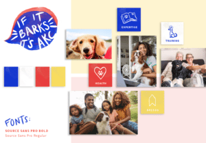
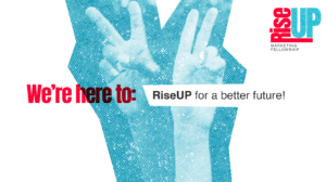
Moodboards are arrangements of custom-designed imagery, language, textures, iconography, and type treatments that are intended to communicate a very specific conceptual direction and visual style.
When are moodboards used?
We typically develop moodboards for campaigns, especially when we’re presenting multiple options for overarching concepts, which include both messaging and visual components.
For example, if we’re concepting a campaign for environmental justice, we might present three distinct conceptual moodboards: one that leans into earthy or organic textures, with imagery that’s rooted in nature and language that speaks to the outside world; a second moodboard might be more grounded in human connection, with imagery of people and communities, and language that speaks to interconnectedness; and a third moodboard might take a bolder, more aggressive activism approach using large, thick type and distressed textures.
Why are moodboards used?
This format allows us to most accurately communicate the spirit, tone, and personality of creative approaches through fully-designed elements that are intended to carry-over into the campaign itself. This is especially important for campaigns that include multiple channels and executions, such as landing pages, digital ads, videos, social content, etc., as it’s much easier to visualize how all of the elements will feel cohesively across the various touch points.
How are moodboards used?
Before beginning any campaign work, we present each moodboard to our client and explain our creative strategy behind each of the different directions. We encourage our clients to look at the elements individually, but also as complete stories. If a font is too far of a departure from their brand style, for example, that’s an element that can be adjusted. However, if multiple elements in a moodboard feel too far off, it’s likely not the right direction. Because of this, we typically ask our clients to provide feedback based on the overall impact and take away from the moodboards first. How do they make you feel? Do they capture the spirit that’s intended? Is the overall visual and concept delivering your intended message? If all of those questions are a “yes,” we can tweak individual components along the way.
Moodboard examples:

Style Tiles
What are style tiles?
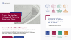
A style tile is a layout composed of various visual elements—including fonts, color palette, imagery, textures, and iconography—that when combined, create a system that can be applied to a microsite or website with multiple pages.
When are style tiles used?
We typically design style tiles for web projects and usually present two to three options to a client. Very often a nonprofit has brand guidelines that they want to adhere to, but want to “freshen up” the visual direction for a website redesign. It’s helpful for us and the client to develop and examine different options for how the design might come to life. While one nonprofit might prefer a tried-and-true, safer direction, wanting to leverage what has worked well in the past, another might prefer a radical, unexpected reinterpretation of their brand guidelines. Very often we can’t predict which direction a client will prefer, which keeps things exciting.
Why are style tiles used?
This format allows us to do two very important things. First, it establishes an agreed upon visual language with the client which helps to minimize surprises for both parties later on in the process. Second, it establishes a system that helps us anticipate how design decisions will affect deliverables way down the line.
How are style tiles used?
Once we have an agreed upon visual direction in the form of an approved style tile, we can begin designing the pages of a microsite or website. The individual elements established in the style tile are applied to any and all pages we need to design. Style tiles don’t solve every problem upfront or include every possible scenario, but they do provide an important roadmap for us and the client as we work to create potentially dozens of pages of a website.
Style tile examples:


Style Guides
What are style guides?
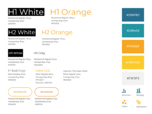
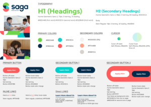
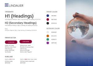
A style guide is very similar to a style tile but serves a totally different function. While style tiles help us establish a visual language for a web project with a client, a style guide helps us establish a visual language for a web project with the developers. Style guides are a visual reference guide or specs we create for the developers, which provide precise details about layout, padding, the height, and width of elements, text styles, web safe color values, and most visual assets needed to start coding a website.
When are style guides used?
We typically create style guides after a homepage and one or more interior web pages have been designed, revised, and approved by the client. These first page designs usually establish most decisions for a web project and give developers enough information to set up global styles and/or CSS (Cascading Style Sheets). We often continue to create page designs after the style guide has been given to the developers, but it allows them to start the development phase while continuing with the design phase.
Why are style guides used?
This format allows us to distill down most design decisions for a web project into one handy reference guide. Whether we are creating three-page designs or three dozen, these specs allow the developers to code the entire site.
How are style guides used?
Turning a visual design into HTML code requires some knowledge on both the part of the designer and the developer—each needs a rudimentary understanding of the other’s skillset. The style guide acts as the intermediary between these two disciplines. The designer deconstructs the visual elements of the page designs and applies simple HTML values to each. This allows the developer to see all the individual elements needed to create the structure of a website and provides the starting point to write all the code.
Style guide examples:
Stylescapes
What are stylescapes?
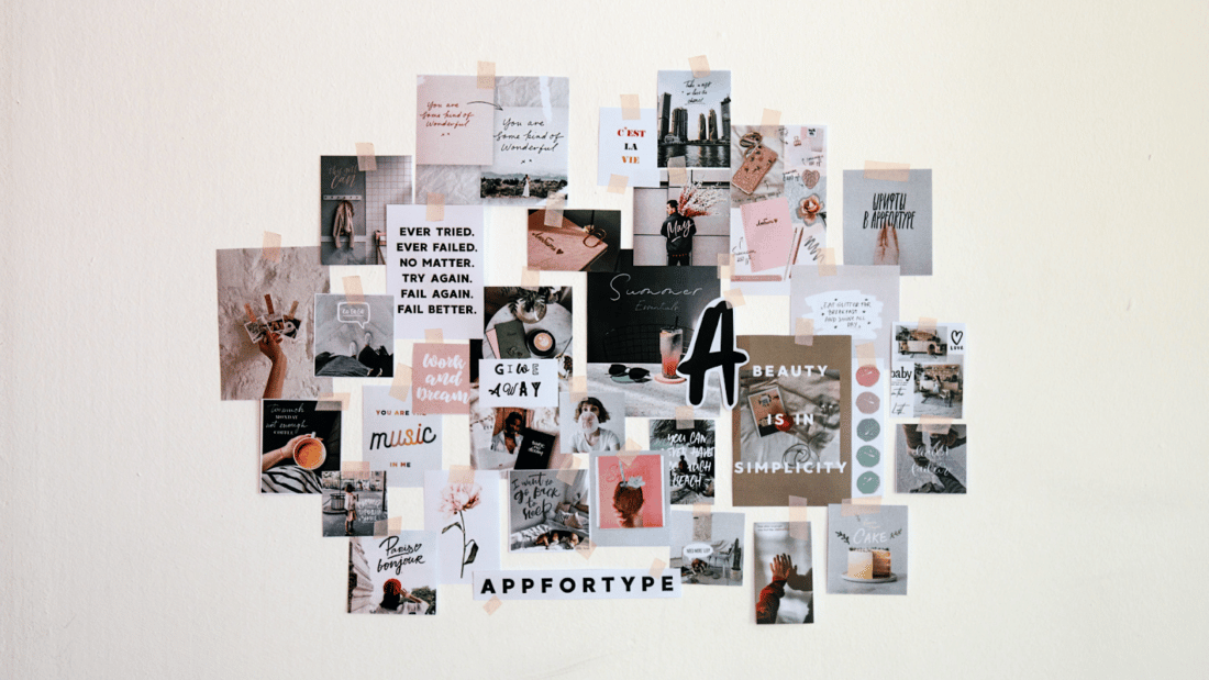
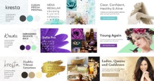
Stylescapes are arrangements of curated imagery and language that are intended to establish a common visual language between us and a client. Its purpose is to illustrate how a design direction might come to life and be applied to multiple touchpoints.
When are stylescapes used?
We typically develop stylescapes when creating a new brand or updating an existing brand. For example, we might help a nonprofit create a new brand from scratch or help them define or refine how their brand affects new deliverables.
Why are stylescapes used?
This format allows us to accurately communicate the vibe and tone of creative approaches through sourced elements intended to inform the design process to come. This quick and rough approach lays the groundwork for the harder decisions—the more detail-oriented work to come.
How are stylescapes used?
Before beginning any actual design work, we present two-to-three stylescapes to a client and explain the creative strategy behind each of the directions. We encourage the client to take in the vibe, the tone, the big picture, and decide which feels right. This is not about details, it’s about emotion. How do they make you feel? Do they capture the spirit that’s intended? Is the overall visual direction conveying the intended feeling?
Stylescape examples:

Credit: thefutur.com

Credit: medium.com
Credit: medium.com
At Media Cause, we’re grateful to work on many different design projects for a variety of nonprofits, each with their own needs and requirements. Our ultimate goal is to help the organizations we serve create the greatest impact.
So the next time you’re thinking about a website refresh, a rebrand, or a marketing campaign, make sure that the creative team you’re working with is able to bring fresh perspectives, insights, and unique approaches to your specific objectives. Not only will it make a difference in your short-term project, but it’ll have a significant impact on your long-term success, as well.
Interested in exploring our creative and design services? Check out some of our work here or contact us to learn more.